Typography - Task 1: Exercise 1 & 2
30/9/2023 - 5/11/2023 / Week 1 - Week 6
Cindy Clarissa Leslie / 0367677Typography / Bachelor of Design (Hons) in Creative Media
Task 1: Exercise 1 & 2
LECTURES
Week 1: Lecture 0 & 1
Development / Timeline
Early Letterform Development

Figure 1.1 Table of the different evolutions originating from Phoenician letters. Week 1, 30/09/2023
Phoenician letters: The origin of modern Latin and Arabic letters, an early developed writing system.

Figure 1.2 Early development of writing styles used by the Greeks, 'Boustrophedon'. Week 1, 30/09/2023
Phoenicians wrote from right to left, meanwhile the Greeks alternatively changed from right left, left to right with the orientation of each letters changing. However both did not include letter spacing or punctuations.

Figure 1.3 Timeline on the development of modern Roman letters. Week 1, 30/09/2023
Using brushstrokes that broaden/weighted in certain horizontal/vertical, creating the modern look we are used to now.
Different Types of Hand Scripts

Figure 1.4 Square Capitals (4th or 5th century). Week 1, 30/09/2023
Square Capitals are mostly found in Roman Monuments, characterized by serifs added to the finish of main strokes.

Figure 1.5 Rustic Capitals (late 3rd to mid 4th century). Week 1, 30/09/2023
Rustic Capitals are used mostly for efficiency, it is a compressed version of square capitals which allows for twice of wordcount on a sheet of parchment and saves more time. Both are used in documents for intended performance.

Figure 1.6 Roman cursive (4th century). Week 1, 30/09/2023
Roman cursive was one of the early cases of lowercase letterforms as a result of writing fast, also used for speed efficiency in writing however for everyday transactions.

Figure 1.7 Uncials (4th to 5th century). Week 1, 30/09/2023
Uncials were influenced by Roman cursive hand. These are simply seen as small letters that are easier to read in small sizes in comparison to rustic capitals. These letters didn't have any lowercase or uppercase.

Figure 1.8 Half-uncials (C.500). Week 1, 30/09/2023
Half-uncials are early formalized lowercase letterforms, supported by ascenders and descenders.

Figure 1.9 Caloline miniscule (C.925). Week 1, 30/09/2023
Caloline miniscule was said to unify Europe as it is the standardized script used in texts. Had been set as a standard for calligraphy for a century, where uppercase, miniscule, capitalization and punctuation had been utilized.

Figure 1.10 Back letter (textura) (c.1300). Week 1, 30/09/2023
Back letter is one of the regional variation that had been influenced by geography, especially after the dissolution of Charlemagne's empire, individuality had been developed.
Week 2: Lecture 2
Text/Tracking: Kerning and Letterspacing

Figure 2.1 Comparison of using kerning and without. Week 2, 04/10/2023
Kerning refers to the automatic adjustments of spaces that have been applied between letters. Meanwhile the addition or substraction of space is referred to tracking.

Figure 2.2 Types of tracking. Week 2, 04/10/2023
Types of tracking:
- normal
- loose
- tight
Uppercase letters are drawn to be able to stand on their own, in comparison to lowercase letters which will need counterforms to be able to maintain a proper line of reading.
Text/Formatting Text

Figure 2.3 Flushed left text format. Week 2, 04/10/2023
Flushed left - mirrors the real life experience of handwriting where it would be asymmetrical. Each lines would start at the same point but end at where the word in the last line ends.

Figure 2.4 Flushed right text format. Week 2, 04/10/2023
Flushed right - Emphasis on the end of a line.

Figure 2.5 Justified text format. Week 2, 04/10/2023
Justified - similar to centering where it imposes a symmetrical shape on the text by expanding or reducing space between words/letters.
Text/Texture
Affects the readability, some can be designed specifically for screen reading. Factors such as gray value, contrast, thin and thick stroke would be considered
Text/Leading and Line Length
Type size - should be large enough to be read easily at arm length
Leading - set too highly would encourage vertical eye movement, set too loosely creates striped patterns that distracts readers.
Line Length - Short lines require less reading, longer lines require more. Tip: keep line length between 55-56 characters.
Text/Type Specimen Book
Text should create a field that can occupy a page/screen. Ideal: middle gray value.
Week 3: Lecture 3
Text/Indicating Paragraph

Figure 3.1 The use of pilcrow in a text. Week 3, 11/10/2023
Pilcrow(¶) - A holdover from medieval manuscripts to indicate paragraph
Leading - the space between two sentences.
Figure 3.2 The use of indent in paragraphs. Week 3, 11/10/2023
Indent is best used when the text is justified, typically the ident is the same size of the line spacing or the same as the point size of your text. Used in academic writing for functional reasons.
Text/Widows and Orphans

Figure 3.3 Widows and orphans found in a text. Week 3, 11/10/2023
Widow - a short line of type left alone at the end of a column of text. Good to avoid as much as possible in typography by reducing column width.
Orphan - a short line of type left alone at the start of new column
Text/Cross Alignment

Figure 3.4 Cross aligning texts. Week 3, 11/10/2023
Week 4: Lecture 4
Basic/Describing Letterforms

Figure 4.1 Terms in describing letterforms. Week 4, 18/10/2023
Baseline - imaginary line of the visual base of the letterforms
Median - imaginary line defining the x-height of letteforms
X-height - the height in any typeface of the lowercase 'x'
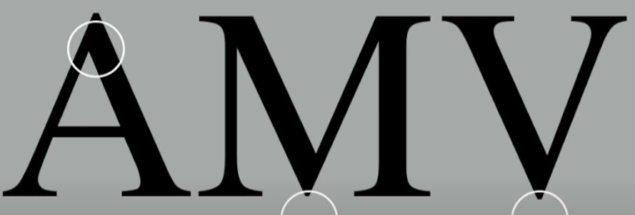
Figure 4.2 Example of apex and vertex in letters. Week 4, 18/10/2023
Apex/Vertex - point created by joining two diagonal stems (apex above, vertex below)

Figure 4.3 Arms shown in a typeface. Week 4, 18/10/2023
Arm - short strokes off the stem of the letterform, either horizontal (E, F, L) or inclined upward (K, Y)

Figure 4.4 Ascender in a typeface. Week 4, 18/10/2023
Ascender - portion of the stem of a lowercase letterform that projects above the median

Figure 4.5 Em and en in a typeface. Week 4, 18/10/2023
Em/en - refers to the width of an uppercase M, em is the distance equal to the size of the typeface

Figure 4.6 Terminals in different typefaces. Week 4, 18/10/2023
Terminal - self-contained finish of a stroke without a serif. May be flat, flared acute, grave, concave, convex or rounded as a ball or a teardrop.
Week 5: Lecture 5
Typography: Letters

Figure 5.1 Grid showing the asymmetry of a letter. Week 5, 25/10/2023
Uppercase letterforms may look symmetrical, they are however created in an asymmetrical to create a rather harmonious and heightens its dynamism.
Letters/Maintaining X-Height

Figure 5.2 X-height of a letterform. Week 5, 25/10/2023
Letters/Maintaining X-Height

Figure 5.3 Counterform of a letterform. Week 5, 25/10/2023
Counterform refers to space between letters, this should be kept in mind as how the counterforms are handled would affect the readability. Examine them in detail to be able to provide a good feel of how balance is achieved and gives a glimpse of the process of letter-making.
INSTRUCTIONS
Task 1: Exercise 1 [Type Expression]
Research

Figure 4.1 Examplar expressive typography collected. Week 2, 05/10/2023
Within this task, we were assigned to create a type expression based on 4 words that have been given, to which I have chosen: drunk, spooky, impact and smoke. Before starting my sketch, I went on the internet to find inspiration, I specifically chose these by how they were able to manipulate, certain elements of the text, such as distorting it, cutting it out and placing it into certain positions in order to represent the words well. 10 fonts were given and limited graphical elements were allowed.
Sketches

Figure 4.2, sketches of chosen words. Week 2, 05/10/2023
These are the sketches that I have came up with, where I have hand drawn a total of 16 different sketches. These will be the base where I choose the best ones that I can convert digitally in Adobe Illustrator.

Figure 5.1 First attempt at the word 'spooky'. Week 3, 12/10/2023
In my first attempt at expressing this word, I initially planned digitalizing based on the 'blood dripping' sketch I made, however I realized after that the font itself wasn't able to retain the spooky effect well and that there was too rather too much graphical element that was needed for me to execute the word well. I ended up being dissatisfied and changed it based on my eye sketch.

Figure 5.2 2nd attempt of 'spooky' and after feedback. Week 3, 13/10/2023
I decided to execute the sketch with eyes, where I was able to experiment and change the positioning of certain letters in order to emphasize the eyes more. To refrain from using much graphical elements, I used the letter 'O' to act as its pupils and draw a line between the erased lines of the larger 'O's. After receiving feedback however, I found that it would be better for me to remove the line I added in and let it act as a white plaster over the angry eyes.

Figure 5.3 Process of digitalizing 'drunk'. Week 3, 12/10/2023
The process for this word was simpler. To create this 'echo' effect, I copy and pasted the individual letter and erased a part of it using the eraser tool. I would then lower the opacity and apply gaussian blur. I repeated this step for the first and last letters which then got to my final design.

Figure 5.4 Process of digitalizing 'impact'. Week 3, 12/10/2023
The process for this word took the most time, firstly, I had to explore the fonts and make sure that I find one typeface that would be strong enough to express the word, to which I found that bold fits it best. In order to create the cracks, I had to convert the text into an object first, then by using the pen tool I would create random jaggy strokes through the text and divide it to the individual letter by using pathfinder. Lastly, I would move, delete and rotate the broken pieces after I isolated each of the cracks, I repeated this process until I'm satisfied with my design.

Figure 5.5 Process of digitalizing 'smoke'. Week 3, 12/10/2023
For this design, I also had to convert the text into an object especially since I used the warp tool. Using warp, I was able to distort the text and create this flame like shape going upwards, I also had to make sure that the bottom half wasn't distorted in any way. Next, using the pen tool, I was able to sharpen the flame-like shape and add in small details. In the end, I set in gradient to each of the letters, where it is black on the bottom, slowly turning white on the top to replicate a smoke effect. I repeated this process for each and every individual letters.
Final Task 1: Exercise 1 - Type Expression

Figure 5.6, Final type expression jpg. Week 3, 13/10/2023
Figure 5.7, Final type expression pdf. Week 3, 13/10/2023
After certain trial and errors with experimenting, I was able to come up with my final designs. I was also able to improve some of them by implementing the general feedbacks and directed feedbacks.
Animation

Figure 6.1 Creating frames of the animation in Illustrator. Week 3, 13/10/2023
I had chosen the word 'impact' to animate, where I had envisioned the text to drop down and cause itself to break into pieces. Using illustrator, I was able to change the position of the text frame by frame in order to create a falling animation. For the breaking part at the end, I had to rotate and slowly separate the pieces in the words. I had created a total of 15 frames.

Figure 6.2 Using photoshop to convert frames into a full gif. Week 3, 13/10/2023
Next, I imported the files into photoshop to create the frame animation. In this process, I went through a trial and error, changing back and forth between illustrator and photoshop to either change the positioning or angle. I was first dissatisfied with the speed of falling therefore I created drastic differences in positioning between frames to create a more impactful drop. At the end I exported the animation into a gif.

Figure 6.3 First attempt of gif animation. Week 4, 19/10/2023
After receiving feedback, I was able to change more of the frames to be able to create a more believable breaking effect.
Final Task 1: Exercise 1 - Text Expression Animation

Figure 6.4 2nd attempt of gif animation. Week 4, 19/10/2023
Task 1: Exercise 2 [Kerning and Tracking]
Kerning
In this task we were required type in our name using the 10 fonts provided and kerned them individually.

Figure 7.1 Letterforms without kerning. Week 5, 25/10/2023

Figure 7.2 Letterforms after kerning. Week 5, 25/10/2023
The new knowledge of kerning is then applied in creating a layout that is easily readable for the viewers.

Figure 7.3 Text before kerning. Week 5, 25/10/2023

Figure 7.4 Text after kerning. Week 5, 25/10/2023
Layouts

Figure 7.5 Different layouts made. Week 5, 26/10/2023
Figure 7.6 Layout #1. Week 5, 26/10/2023

Figure 7.7 Layout #2. Week 5, 26/10/2023

Figure 7.8 Layout #3. Week 5, 26/10/2023

Figure 7.9 Layout #4. Week 5, 26/10/2023
I decided to leave out #3 and #4 as the final submission since it is more recommended to use 4 columns to safely follow the minimum character rule. The only feedback I have gotten is to remove a certain image from layout #1.

Figure 7.10 visual element before feedback. Week 5, 27/10/2023
Figure 7.11 visual element after feedback. Week 5, 27/10/2023
Final Task 1: Exercise 2 - Text Formatting
HEAD
Font/s: Univers Lt Std (light and bold)
Type Size/s: 25 pt
Leading: 30 pt
Paragraph spacing: 4,233 mm
BODY
Font/s: Adobe Caslon Pro
Type Size/s: 10 pt
Leading: 12,5 pt
Paragraph spacing: 12,5 pt
Characters per-line: approx. 55-60
Alignment: Left align
Margins: 12,7 mm top, 12,7 mm left + 12,7 mm right + 100 mm bottom
Columns: 4
Gutter: 5 mm

Figure 8.1 Final text formatting without grid. Week 5, 27/10/2023

Figure 8.2 Final text formatting with grid. Week 5, 27/10/2023
Figure 8.3 Final text formatting pdf. Week 5, 27/10/2023
FEEDBACK
Task 1: Exercise 1 [Type Expression]
Week 2
General Feedbacks
Distortions within the text should always be kept minimal, same goes to the graphical elements. The letterforms itself should be the main emphasis and shouldn't be overly illustrative in nature, however should still be able to present the words well.
Direct Feedbacks
4th drunk and 1st impact is already good enough, can be worked on. For the spooky text, the idea can be executed however the blood trickling down should be minimal. The eyes within the spooky text can be executed when the text is not distorted to keep it balanced. Smoke is executable if the distortion can be minimized to only be at the top half.
Week 3
General Feedbacks
The size of the letters should be kept to mind and make sure that it is able to take up the space given by the template, make sure that the design of the expressions are impactful. Design should be able to embody and express the words. The text should not be stretched in any way.
Direct Feedbacks
The digitalized designs are already good enough except for 'spooky', remove the lines drawn in the eyes. Provide process work for the digitalization in the blog. Blog should be more organized and be able to divide the weeks especially for the lecture part.
Week 4
Direct Feedbacks
The gif animation can be further improved if the text itself wouldn't bounce or the individual letters could bounce irregularly.
Task 1: Exercise 2 [Kerning and Tracking]
Week 5
General Feedbacks
Visual asset should be in correlation to the contents of the text itself, visual assets that are composed of textual elements should be avoided. Text and image should not be overlapping. The leading should be 2.5 to 3 points larger. Amount of Texts should be rather more balanced. Texts should follow the column. All uppercase on the heading should be avoided, character count should strictly be between 45 to 60.
Direct Feedbacks
Delete a certain image to improve the layout
REFLECTION
Experience
Since this was still the first task, the whole concept of typography was quiet unfamiliar to me. Although I've done designs that include typography, being able to study and focus solely on this aspect is fairly new. What was challenging was definitely coming up with ideas since not only the expression words are limited, but the fonts were also already decided. With rules such as no distorting or graphical elements, I doubt myself if I was able to execute my ideas well that could express the words accurately since I tend to overexert myself in a design. However, during the design process I learned that designs don't have to be overly complicated and could be kept at minimal for it to be satisfactory, when I was able to overcome this roadblock, I eventually was able to come up with different ideas I can work with. The other thing I struggled with was also using the applications, although I was more familiar with illustrator, InDesign was very much new to me but the video tutorials were able to help me a lot and help me adapt to what I'm working with.
Observations
Within typographical design, the text itself should be the main focus instead of adding in graphical elements to make it seemingly 'aesthetically pleasing'. The rules of simplicity is more applies to designs in typography. There are many different ways of designing in typography, such as kerning, using the right typeface, changing the bowl, manipulating the strokes etc, which are generally small changes that would eventually affect the overall end design.
Findings
Typography may seem simple on the surface, but it is actually deep with unwritten rules in designing and even a whole history behind it. Though being a designer is to be creative and breaking the rules, there should be a balance of being able to apply it onto designs to ensure functionality. Typographical development have definitely left a huge impact on how society works, where people rather underestimate the power of truly understanding typography. Without the development of typography, communication would be rather flawed as it is used to enhance the message an author is trying to get across to the audience.
FURTHER READING
A Type Primer 2nd Ed by John Kane

Figure 9.1 Typographical book for beginners
Kane, John. A Type Primer. Vol. 2, Laurence King Publishing, 2019.
Kane, John. A Type Primer. Vol. 2, Laurence King Publishing, 2019.
For my further reading, I specifically chose A Type Primer by John Kane since it is a book I believe can be easy for me to understand and expand my knowledge into typography. This book is handy for those who are beginners in this module.

Figure 9.2 Terminology in typography. Week 1, 30/09/2023
Basics: Describing Letterforms, page 2
In order to familiarize myself with typography, I first leaned the proper terminologies which is beneficial since I would gradually learn to focus on the small aspects that I can manipulate in order to make up for unique designs. These terminologies would expand up to page 4.

Figure 9.3 Different typefaces recognized. Week 2, 04/10/2023
Basics: Describing typefaces, page 8
One of the other basics introduced me to the different kinds of typefaces that can be found in typography. These types include:
- Roman - basic letterforms, uppercase forms were derived from Roman monument inscriptions, the term 'roman' is always lowercase when referred as a type style.
- Italic - based on 15th century Italian handwriting.
- Boldface - thicker stroke than the roman form.
- Light - lighter stroke than the roman form.
- Condensed - condensed version of the roman form. (Extreme are referred to as compressed)
- Extended - extended version of the roman form.

Figure 9.4 Digitalization of letterforms. Week 3, 11/10/2023
Development: Digital type, page 46
This page was mostly focused on how these letterforms have been developed in the beginning of modernization, where digital devices have been invented. During the 1980s, designers had to resort to medieval scriptoriums to design, typeset and illustrate. In 1981, Bitstream offered digital typefaces to which Adobe Inc. followed after. By 1990, every type foundry offered digital versions of their typefaces.

Figure 9.5 Development of typefaces throughout the years. Week 4, 18/10/2023
Development: Text typeface classification, page 48
Different typefaces can be recognized as typography continues developing, creating new kinds that should be differentiated as they would have different functionality, thus affecting the perspective of the readers. The different typeface recognized over the years includes blackletter, oldstyle, italic, script, transitional, modern, square serif, sans serif and serif.

Figure 9.6 Different typefaces for different functions. Week 5, 25/10/2023
Letters, words, sentences: Making sentences, finding sense, page 72
This section mostly gave out tips on how to choose a preferable letterform for a text, which is decided by certain factors such as:
- content of the text
- tone of author's voice
- period of text written
- intended audience
Using the right typeface would leave a rather positive impact, as the message of the text itself can be conveyed further for the viewers to understand. The examples provided with different typefaces were able to represent the content of the texts.
Comments
Post a Comment