Advanced Typography - Task 1: Exercises 1 & 2
22/4/2024 - 13/5/2024 / Week 1 - Week 4
Cindy Clarissa Leslie / 0367677
Advanced Typography / Bachelor of Design (Hons) in Creative Media
Task 1: Exercise 1 & 2
Advanced Typography / Bachelor of Design (Hons) in Creative Media
Task 1: Exercise 1 & 2
LECTURES
Week 1: Lecture 1
Typographic Systems
Eight Major Variations

Figure 1.1 Use of axial system in typography by type 365. Week 1, 22/4/2024
Axial System - all the elements are organized to the left or right of a single axis.
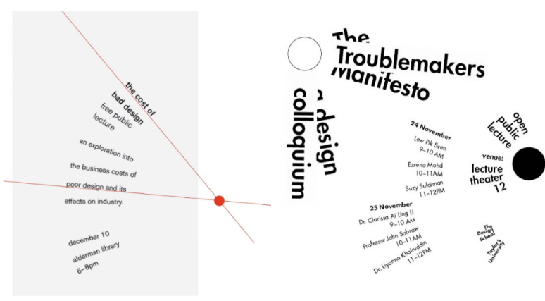
Figure 1.2 Use of radial system in typography. Week 1, 22/4/2024
Radial System - all elements are extended from a point of focus.

Figure 1.3 Use of dilatational system in typography. Week 1, 22/4/2024
Dilatational System - all elements expand from a central point in a circular manner.

Figure 1.4 Use of random system in typography. Week 1, 22/4/2024
Random System - elements have no specific pattern or relationship.

Figure 1.5 Use of dilatational system in typography. Week 1, 22/4/2024
Grid System - vertical and horizontal divisions.

Figure 1.6 Use of transitional system in typography. Week 1, 22/4/2024
Transitional System - informal system of layered banding.

Figure 1.7 Use of modular system in typography. Week 1, 22/4/2024
Modular System - non-objective elements that are constructed in as a standardized units.

Figure 1.8 Use of bilateral system in typography. Week 1, 22/4/2024
Bilateral System - all text is arranged symmetrically on a single axis
Week 2: Lecture 2
Typographic Composition

Figure 2.1 Rule of thirds composition. Week 2, 29/4/2024
The Rule of Thirds - suggests that a frame can be divided by 3x3 (3 columns and 3 rows). Intersecting lines act as a guide to place points of interest. (No one would use rule of thirds when there are more favorable options.
Typographic Systems
The grid system is the most used system, which is derived from grided compositional structure of Letter Press printing. The system remains popular as it allows infinite number of adaptations despite seeming rigid due to its versatility.

Figure 2.2 Modern typography works. Week 2, 29/4/2024

Figure 2.3 Using environmental grid on a typographical work. Week 2, 29/4/2024
Environmental grid - based on the exploration of existing structures combined, where crucial lines both curved and straight are formed, creating a new yet interesting mixture of visual stimuli .

Figure 2.3 Utilizing form and movement on static typography spreads. Week 2, 29/4/2024
Form and movement - based on existing grid systems, explores the effect of turning pages in a book comprised from the placement of image, text and color.
Week 3: Lecture 3
Context & Creativity
Handwriting

Figure 3.1 Cuneiform c. 3000 B.C.E. Week 3, 6/5/2024
Cuneiform - refers to the earliest system of writing. Pressing blunt end of a reed stylus into wet clay tablets. Read from left to right

Figure 3.2 Hieroglyphics 2613-2160 B.C.E. Week 3, 6/5/2024
Hieroglyphics - mixture of rebus and phonetic characters. The images are utilized in 3 different ways:
- Ideograms - represent things they depict
- Determinatives - signs are referred as phonogram indicating general idea of the word
- Phonograms - sounds that "spell out" individual words

Figure 3.3 Early Greek 5th B.C.E. Week 3, 6/5/2024
Early Greek - development of phonetic alphabets, consisted of 22 letters. Direction of reading was still not rigid.

Figure 3.4 Roman Uncials. Week 3, 6/5/2024
Roman Uncials - letters became more curved

Figure 3.5 English Half Uncials, 8th C. Week 3, 6/5/2024
English Half Uncials - More slanted and condensed.

Figure 3.6 Carolingian Minuscule. Week 3, 6/5/2024
Carolingian Minuscule - standardized script used for all legal and literary works during Charlemagne's reign. Foundation for the lower-case roman typeface.
Week 4: Lecture 4
Designing Type
Process of Type Design
Research - understanding type history, type anatomy and type conventions in order to create a good type. Determine the type's purpose and applications. Examine existing fonts as a reference.

Figure 4.1 Sketch of Johnston Sans by Edward Johnston. Week 4, 13/5/2024
Sketching - there are two ways designers sketch their types:
- Traditional - brushes, ink, pen and paper, scanned for the purpose of digitalizing it
- Digital - wacom, drawing tablets etc, quicker, persistent and consistent.
Digitization - Using professional software such as FontLab and Glyphs

Figure 4.2 Prototype Stencil (Stenz) by Vinod J. Nair. Week 4, 13/5/2024
Testing - Refining and correcting any lacking aspects of the typeface, especially for leading and readability problems.
Deploy - Refinement may still be needed after deployment, always revise.
INSTRUCTIONS
Task 1: Exercise 1 [8 Typographic Systems]
Process
.png)
Figure 5.1 Process of creating a design for each systems. Week 1, 26/4/2024
Design Ideas
.png)
Figure 5.2 First attempt on axial systems. Week 1, 26/4/2024
Starting with axial, I found that this system was pretty simple to grasp, where I used the rotation tool to change the angle of the tilt and such. After getting private feedbacks, I learned that combining both italic and bold isn't preferrable, so I made a small change and switched the typeface on the names of the lecturers to only bold.
fonts used:
left: Univers LT Std (Roman, Bold, Black Extended, Extra Black Extended)
right: ITC Garamond Std (Book Narrow, Light Condensed, Bold Narrow, Regular)
.jpg)
Figure 5.3 First attempt on radial systems. Week 1, 26/4/2024
For the second design, I wanted to somewhat incorporate a sun into my design, where the text acts as rays of light surrounding the red dot.

Figure 5.4 Revised radial system design for idea 1. Week 2, 29/4/2024
After receiving feedback, I learned that I should text wrap around the circle individually instead of the whole text blocks. I also added splashes of red to make the design stand out even more. Designs for this system overall took more time due to these individual arrangements.
fonts used:
left: Futura Std (Extra Bold, Book, Bold, Heavy)
right: Univers LT Std (Roman, Bold, Black Extended, Extra Black Extended)
.png)
Figure 3.5 First attempt on dilatational systems. Week 1, 26/4/2024

Figure 5.6 Revised dilatational system design for idea 2. Week 2, 29/4/2024
fonts used:
left: Univers LT Std (Roman, Bold, Black Extended, Extra Black Extended)
right: Janson Text LT Std (Bold, Italic, Regular), Univers LT Std (Bold)
.png)
Figure 5.7 First attempt on random systems. Week 1, 26/4/2024
For both ideas in random system, I wanted to incorporate all the typefaces to embody the 'randomness' fully. I arranged them and mixed everything up as messy as possible while also ensuring readability.

Figure 5.8 Revised random system design for idea 1. Week 2, 29/4/2024
fonts used:
left: all fonts
right: all fonts

Figure 5.9 First attempt on grid systems. Week 1, 26/4/2024
fonts used:
left: left: Futura Std (Extra Bold, Book, Bold, Heavy)
right: Bodoni MT (Condensed Italic). ITC Garamond Std (Light Condensed, Regular), Futura Std (Book)
.png)
Figure 5.10 First attempt on transitional systems. Week 1, 26/4/2024
fonts used:
left: Univers LT Std (Roman, Bold, Black Extended, Extra Black Extended)
right: Adobe Caslon Pro (Bold, Italic, Semibold, Regular)
.png)
Figure 5.11 First attempt on modular systems. Week 1, 26/4/2024
fonts used:
left: Futura Std (Extra Bold, Book, Bold, Heavy)
right: Bodoni MT (Condensed Italic, Poster Compressed, Bold), Futura Std (Bold, Book)
.png)
Figure 5.12 First attempt on bilateral systems. Week 1, 26/4/2024
Though the bilateral system was simple to grasp, I still tried to be experimental as possible especially with the arrangements on my second design. Though after receiving feedback, I found that my ideas didn't go along with the rules of the system itself.
.png)
Figure 5.13 Revised bilateral system design for both ideas. Week 2, 29/4/2024
After revising it, I make sure every information is center aligned and in one text box.
fonts used:
left: Univers LT Std (Roman, Bold, Black Extended, Extra Black Extended)
right: ITC Garamond Std (Book Narrow, Light Condensed, Bold Narrow, Regular)
Final Task 1: Exercise 1 - 8 Typographic Systems

Figure 6.1 Final axial system, JPEG. Week 2, 29/4/2024

Figure 6.2 Final radial system, JPEG. Week 2, 29/4/2024

Figure 6.3 Final dilatational system, JPEG. Week 2, 29/4/2024

Figure 6.4 Final random system, JPEG. Week 2, 29/4/2024

Figure 6.5 Final grid system, JPEG. Week 2, 29/4/2024
Figure 6.6 Final transitional system, JPEG. Week 2, 29/4/2024

Figure 6.7 Final modular system, JPEG. Week 2, 29/4/2024

Figure 6.8 Final bilateral system, JPEG. Week 2, 29/4/2024
Figure 6.9 Final 8 typographic systems, PDF. Week 2, 29/4/2024
Figure 6.10 Final 8 typographic systems, PDF with guides. Week 2, 29/4/2024
Task 1: Exercise 2 [Type and Play]
First Attempt of Letter Extraction

Figure 7.1 Subject chosen to extract letters. Week 2, 3/5/2024

Figure 7.2 Letters extracted in Adobe Illustrator. Week 2, 3/5/2024
I was able to outline and form the letters by using the pen tool, this will serve as a foundation in designing them.

Figure 7.3 Extracted letters on first attempt. Week 2, 3/5/2024
During my first attempt, I arranged the word in H, X, Y, A. This idea was eventually scrapped since I reconsidered in an arrangement that is more 'readable'.
Digital attempts and process

Figure 7.4 First attempt in designing the letters H X Y A. Week 2, 3/5/2024
I eventually scrapped this attempt since I felt like I strayed too far from the initial letters itself. The 'final' letters did not give me any vibes remotely close to nature and it was overall too inconsistent.

Figure 7.5 Typeface reference. Week 3, 6/5/2024

Figure 7.6 Second attempt of refining the letters. Week 3, 6/5/2024
In this attempt, I wanted to be able to retain the looks of the roots, therefore I tried to make the strokes consistently thin. This idea was eventually scrapped since I realized that the reference picture itself that I chose wasn't good enough to create designs with.
Second Attempt of Letter Extraction

Figure 8.1 Second subject chosen to extract letters. Week 4, 13/5/2024
Again, I chose basically the same thing except this time it is a tree's roots. The shapes are more distinct and organic in comparison to the one I captured.

Figure 8.2 letters 'A X O S extracted from the picture. Week 4, 13/5/2024
Using the same process, I extracted the letters A, X, O and S from the picture.
Second attempt in digitalisation

Figure 8.3 Second typeface reference. Week 4, 13/5/2024
The typeface I chose for this attempt was Futura Std since it had a similar consistent stroke thickness that I'm going for.

Figure 8.4 Refinement process of letters A X O S. Week 4, 13/5/2024
Though the letters were organic, especially full of random curvature. I had to make sure that it stays consistent which I set in the stroke itself. I also made sure that the cap line and baseline were relatively similar for each letters.

Figure 8.4 Final refinement process of letters A X O S. Week 4, 13/5/2024
To top it off fully, I set guides where it decides on the baseline, capline and median. This is where I did my final touches and change strokes that needed more work.

Figure 8.4 Final refinement process of letters A X O S. Week 4, 13/5/2024
Final Task 1: Exercise 2 - Finding Type

Figure 9.1 Compiled process. Week 4, 13/5/2024

Figure 9.2 Extracted letterforms vs final typeface. Week 4, 13/5/2024

Figure 9.3 Final typeface design. Week 4, 13/5/2024

Figure 9.4 Final letter 'A'. Week 4, 13/5/2024

Figure 9.4 Final letter 'X'. Week 4, 13/5/2024

Figure 9.5 Final letter 'O'. Week 4, 13/5/2024

Figure 9.6 Final letter 'S'. Week 4, 13/5/2024

Figure 9.6 Final typeface showcase. Week 4, 13/5/2024
Figure 9.7 Final typeface compilation pdf. Week 4, 13/5/2024
FEEDBACK
Task 1: Exercise 1 [8 Typographic Systems]
Week 2
General Feedbacks
Combine the pictures and process instead so the e portfolio wouldn't be too lengthy. Update the process work daily in e-portfolio, explain your works. Prevent from using too much graphical elements. To emphasize on the word 'punk', make the designs more messy. Make sure that the designs do not go over the borders (especially for printing). Make sure design is balanced, and there is focus present.
Directed Feedbacks
There is no need to use both italic and bold, just use one of those. Change some of the fonts to a sans serif one to make it more readable, combining two different fonts is acceptable. Make the 'random' system more chaotic, 1st one is more interesting. Make sure that the radial one is in border. Change the info in the 'grid' system to a sans serif to make it more readable. When dealing with all caps with uppercase and lowercase letters, reduce the size by 0.5. All the info in 'bilateral' should be in one group and be symmetrical (in the middle).
Task 1: Exercise 2 [8 Typographic Systems]
Week 3
General Feedbacks
consider the weights in each stroke, make sure that the baseline and the capline stays consistent. Font should be able to represent the initial reference picture in some way.
REFLECTION
Experience
I was rather unfamiliar with the concept of using typographical systems, therefore not only was the first exercise rather complicated, it also was time-consuming since I wanted to showcase more than 1 ideas for each of the 8 systems, making 16 different designs in total. Though I wanted to be experimental, it was challenging for me to as I still had to adhere to the systems itself. During the 2nd task however, I found it to be more enjoyable and fun especially in the extraction process from our reference picture. However, it took me several attempts until I was able to feel satisfied with the end work which was due to the reference picture I was initially using. From these mistakes, I learned the importance of using inspo and references since it would affect the end results way more than I would think especially when it comes to this task. I also learned from my different attempts on how to work more efficiently with Adobe Illustrator since I was getting constrained with time, it allowed me to familiarize myself with the process of creating a typeface from a picture.
Observations
I've observed how in designing typography, there are balance that should be considered in many different aspects especially within typographic systems. There should be balance between adhering into conventions while also being experimental enough to make the designs interesting while also ensuring readability (function). There are many small aspects and elements that could make or break the composition, which is why designers should always be mindful whenever they create something.
Findings
There are unwritten rules that can be found within typography, as seen in the system, though we are free to do arrange it in a way, there are systems found to adhere to what is considered a 'good' composition. Within the second task, I found how design can be found everywhere in our life, whether manmade objects or even nature, I found it really interesting and fun how we were able to create typefaces through the extraction of a picture as long as we have the creativity of it.
FURTHER READING
Typographic Systems by Kimberly Elam

I chose Kimberly Elam's Typographic Systems book as it aligns with the whole topic in this task. Using this book, I will be able to familiarize myself and gain additional understandings that would help me improve my designs for each systems.

Figure 10.2 Different typographical systems, page 7. Week 1, 22/4/2024
To understand about the typographical system more, it was good that I was able to gain information from another source other than the lectures. The book was able to provide brief information that was easy to understand supported by images on the side, which was overall beginner friendly.
Axial System - all elements are organized either to the left or right of a single axis
Radial System - All elements extend from a point of focus
Dilatational System - All elements expand from a central point in a circular fashion
Random System - Elements appear to have no specific pattern or relationship
Grid System - A system of vertical and horizontal divisions
Transitional System - An informal system of layered banding
Modular System - A series of non-objective elements that are constructed as standardized units
Bilateral System - All text is arranged symmetrically on a single axis

Figure 10.3 Constraints and Options, page 10. Week 2, 29/4/2024
I learned the different typographic constraints and options that would affect the design differently. By manipulating these aspects, they are able to provide variations that could be experimented with. These aspects are found in a text's line breaks, leading, word and letter spacing.

Figure 10.4 Nonobjective Elements, page 14. Week 3, 6/5/2024
This page shows the convenience of using nonobjective elements in order to manipulate the composition into looking a certain way. These elements are able to enhance the messages trying to get across since it creates a stronger hierarchical order and directs the viewers' eyes better. These elements include: rule series, circle series and tone series.

Figure 10.5 Modular System, Thumbnail Variations, page 126. Week 4, 13/5/2024
From this page, I decided to learn about the modular system more since it was the only system that I was still sceptic about. I learned that this system gives the designer more freedom with being experimental as long as it follows whatever standardized unit it has been set to, these standardized units can take shape not only in squares but also in more complex shapes. As a beginner designer, it would be safer to be using rigid and simple shapes to play it safe while making sure it still adhere to the modular system rules.
Comments
Post a Comment