Application Design 2 - Task 2: Interaction Design Proposal and Planning
29/5/2025 - 02/06/2025 / Week 5 - Week 7
Cindy Clarissa Leslie / 0367677
Application Design 2 / Bachelor of Design (Hons) in Creative Media
Task 2: Interaction Design Proposal and Planning
Application Design 2 / Bachelor of Design (Hons) in Creative Media
Task 2: Interaction Design Proposal and Planning
INSTRUCTIONS
In this task, students were required to do a detailed planning and proposal in listing down all the existing animations (macro and micro) which will be applied onto the final app product. The planning will be broken down into 3 main parts: App Flow Mapping, Master Plan and Animation.
Task 2: Interaction Design Proposal and Planning
App Flow Mapping
The app flow mapping will mostly be based on the expected user flow when they access the app. However, since the app I'm redesigning is a social media app, there is no rigid structure and flow, therefore I made the app flow based on the scenarios I have created in Application Design 1.
Though there are different kinds of scenarios, it all comes from the onboarding page first before landing onto the homepage, where users can access different pages through the navigation bar that is available on the bottom.
Throughout making the app flow, I focused on the transitions of main pages which will be the macro, however I also took small notes of potential micro animations that I could implement. What I've noticed from social medias is that their macro animation are rather simple and limited, especially when switching pages through the nav bar.
I made sure the animations aren't overwhelming and that the functionality of the app is prioritized instead. Here's the app flow mapping below:

Figure 1.1 Flow map of onboarding pages

Figure 1.2 Flow map of first scenario

Figure 1.3 Flow map of second scenario

Figure 1.4 Flow map of third scenario

Figure 1.5 Overall map flow
Master Plan
After finishing the map flow, I proceeded with the master plan, to which I get to be more in detail of the animations within each essential pages. The master plan will include three aspects which are the: onloading, in-app and offloading animations.
The onloading includes in essential transitional animations (macro), where users engage in during their initial loading of a page. Based on the flow, the onloading animations will consist mostly of simple slide in animations, furthermore with ease ins to ensure a smooth experience.
The in-app animations will be whenever user interaction directly takes place, these would include tap targets and CTA buttons (micro) especially since my app has a lot of user engagement tools such as liking and commenting. I try to keep it simple however these animations should be engaging and convince more user interactions.
Lastly, is the offloading, which is essentially the transitions when users reverse or navigate in and out of a page. This one is also involves macro and direct actions from the user.
For consistency, I'd like to ensure that my animations are rather similar or applied effectively the same onto different elements or pages. Not only is this for a seamless yet engaging user experience, but to contribute to the branding of the app.
.png)
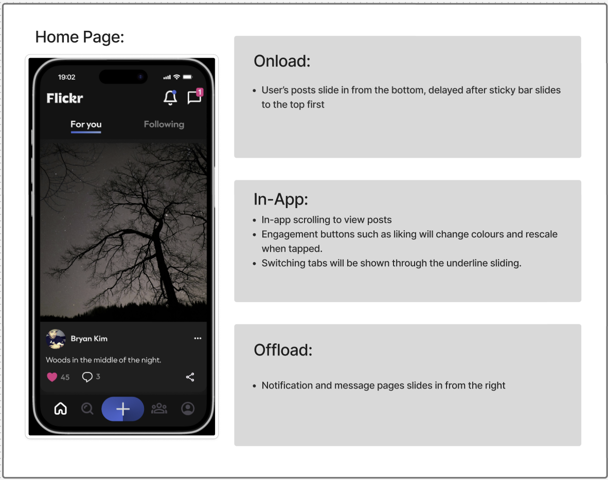
Figure 2.2 Home page masterplan
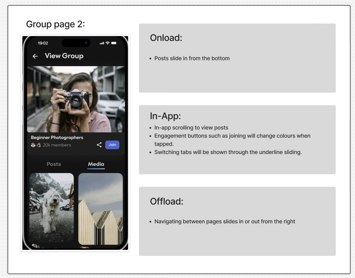
Figure 2.3 Group page masterplan

Figure 2.4 Search page masterplan

Figure 2.5 Profile page masterplan
Figma Prototype/Animating
Since my animation includes a lot of positioning, it wouldn't be possible unless I use smart animate in my pages. To do this, I had to duplicate a lot of the same pages, change elements from its initial to final position and simply connect them by smart animating + delay.
Overlays especially search bars that include the usage of keyboard during a real prototype will be considered as macro animations.
Here's the final prototype including the visible flow lines:

Figure 3.1 Final figma animation prototype
Onboarding
Macro animations:
- Logo fades in and out when first accessing the app
- Page moves left and right during account creation/login process
- Elements in interest page slide in from the bottom
Micro animations:
- 'Flickr' logo/text slides in from above during first onboarding page
- Pressing on an interest includes border and rescaling animation

Figure 4.1 Onboarding prototype
Home Page
Macro animations:
- Elements (posts) will slide from the bottom upon switching tabs/first accessed from logging in account
- Pages from notifications and messages slide in from the right
Micro animations:
- home page icon slightly jumps when pressed from other pages in the navigation bar
- Underline under the tabs switches position depending which tab users are on
- In-app scrolling
- Popup animation for messages and notifications
- Like button changes colour upon pressing

Figure 4.2 Home page prototype
Explore Page
Macro animations:
- Elements (posts) will slide from the bottom upon switching tabs in users tab
- Search bar slides in from the top, dimming the background by 65%
- Slides in and out from the right upon navigating pages
Micro animations:
- Search page icon slightly jumps when pressed from other pages in the navigation bar
- Underline under the tabs switches position depending which tab users are on
- In-app scrolling and horizontal swiping
- Like and follow buttons changes colour upon pressing
- Drop down menu slides from the bottom

Figure 4.3 Explore page prototype
Community Page
Macro animations:
- Elements (posts) will slide from the bottom upon switching tabs in group tab
- Search bar slides in from the top, dimming the background by 65%
- Slides in and out from the right upon navigating pages
Micro animations:
- Community page icon slightly jumps when pressed from other pages in the navigation bar
- Underline under the tabs switches position depending which tab users are on
- In-app scrolling
- Like and join group buttons changes colour upon pressing
- Upload button slides in from above upon joining
- Drop down menus slide from the top

Figure 4.4 Group page prototype
Upload Page
Macro animations:
- Fade in animation when first accessed or during loading page
- Moves left or right upon navigating pages
Micro animations:
- In-app scrolling
- Upload from device button slides in from below, dimming background by 65%
- Progress bar animation

Figure 4.5 Upload page prototype
Profile Page
Macro animations:
- Elements (posts) will slide from the bottom upon switching tabs in group tab
- Page slides in from right upon accessing albums
- Page slides in from the bottom upon editing profile
- Freshly uploaded pictures slide in from the right in within the post tab
Micro animations:
- Profile page icon slightly jumps when pressed from other pages in the navigation bar
- Underline under the tabs switches position depending which tab users are on
- In-app scrolling
- Upload succeed popup slides in from bottom for feedback
- Drop down menus slide from the top or right

Figure 4.6 Profile page prototype
Final Task 2: Interaction Design Proposal and Planning
Figure 5.1 Figma board
Figure 5.2 Figma file
Figure 5.3 Figma prototype
Figure 5.4 Final video presentation
please note i had to speed up the video to reach youtube video length limit, prototype showcase has normal speed.
REFLECTION
Upon doing this task, I was quite unfamiliar with the terminologies that are introduced, especially onload, in-app and offload animations. Therefore I mostly had trouble with categorizing with animations I should group them up in. Thankfully, by referring and checking out other senior's works I was able to grasp a basic understanding and had a more structured idea on how my proposal should look like. Overall, I didn't have much issues with working with Figma, however I figured out how limiting it is when it comes to animations, where I can mostly work with smart animating only. Funny thing is I never knew being an avid social media user would be beneficial especially in this case, I realized that I never really paid attention to the small feedbacks and animations they provide whenever I proceed with an action, which I do now. These small animations really adds onto the user experience positively.


Comments
Post a Comment